Time Series Analysis: Canadian Gas Production (Jan. 1960 - Feb. 2005)
Background and Information
The Canadian Gas dataset comes from Rob Hyndman’s fpp3 package. It
describes monthly gas production in Canada in billions of cubic meters
from January 1960 - February of 2005. Our goal is to understand the
trend and seasonality in our data, and hopefully to model it
appropriately and measure the model accuracy.
This mini-project will be done using the tidyverts, formally called
fpp3, which is an incredibly powerful family of packages for
conducting scalable time series analysis in a tidy framework. Some of
the notable packages in this family include fable, feasts, and
tsibble. The specifics of this framework can be found
here.
We start by examining our time series and considering what type of variability, trend, and seasonality we have.
library(fpp3)
canadian_gas %>%
  autoplot(Volume)
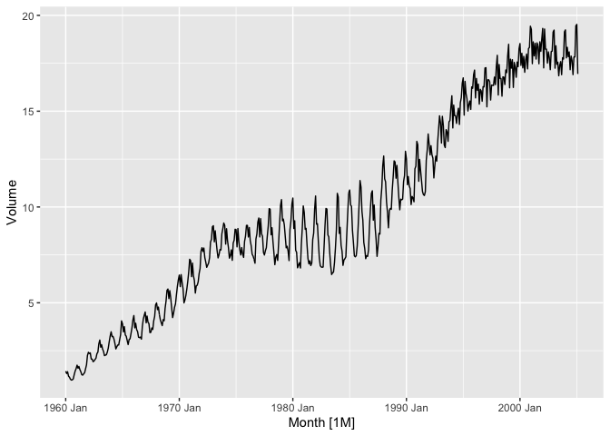
We notice strong yearly seasonality and a clear upward trend. Interestingly, we also see a change in the production pattern from the late 70’s through the early 90’s. What exactly is going on here? Surely it is related to seasonality, but which seasons exactly?
canadian_gas %>%
  gg_subseries(Volume)
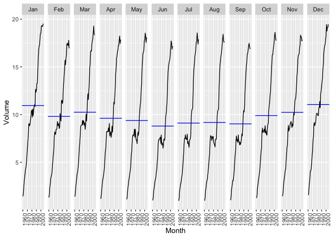
Here, we can get a better sense of the seasonality. It is clear that, in general, more gas is produced in colder months than in warmer months. We also see the stretch of time in the middle of the series where production decreased across the warm months but the cold months maintained growth. This is how we got our increased variability.
Let’s do an STL Decomposition on the series so that we can see the trend, seasonality, and the seasonally adjusted data.
canadian_gas %>%
  model(
    stl = STL(Volume ~ season(window = 12))
  ) %>%
  components() %>%
  autoplot()
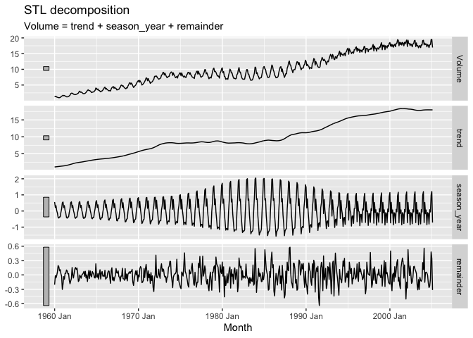
Pretty interesting! The remainder isn’t pure white noise, but with the changes in variability throughout the series this isn’t surprising. Let’s dive deeper and try to see if we can better understand how the seasonality changes during the summer months from the late 70’s to the early 90’s.
canadian_gas %>%
  model(
    stl = STL(Volume ~ season(window = 12))
  ) %>%
  components() %>%
  gg_season(season_year)
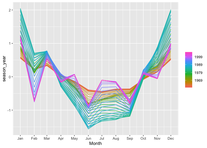
This view perfectly puts the interesting behavior of the seasonal
component of the series in perspective. Note we are plotting
season_year against Month for each year. As time goes on, we see a
much larger swing in production between warm/cold months in the
green/blue years, which represent late 70’s through early 90’s, than we
do at the start and end of the series, represented by the red/orange and
purple years.
Model Fitting and Checking
We can now model our data after our EDA. A number of models could be tried and checked. For simplicity, we will try a Random Walk model with drift, a STL decomposition model with a Random Walk with drift applied to the seasonally adjusted data, and an auto-selected ARIMA model. Our training set will include data up through February 2003 and we will forecast through the end of the series, February 2005.
First, let’s check our residuals to see if assumptions were met. Our assumptions are that our residuals are not autocorrelated and that they have 0 mean. If the mean is not 0 then we can subtract the mean from the value.
canGas_mdl <- canadian_gas %>%
  filter_index(~ "Feb 2003") %>%
  model(
    rw = RW(Volume ~ drift() + lag(lag = 12)),
    stl = decomposition_model(
      STL(Volume ~ trend(window = 12), robust = TRUE),
      RW(season_adjust ~ drift())
    ),
    arima = ARIMA(Volume)
  )

glimpse(canGas_mdl)
## Rows: 1
## Columns: 3
## $ rw    <model> [SNAIVE w/ drift]
## $ stl   <model> [STL decomposition model]
## $ arima <model> [ARIMA(2,0,1)(0,1,2)[12] w/ drift]
We see that an ARIMA(2,0,1)(0,1,2) 12 with drift model was selected by the algorithm which minimizes the AICc for ARIMA models.
Random Walk residuals:
canGas_mdl %>%
  select(rw) %>%
  gg_tsresiduals()
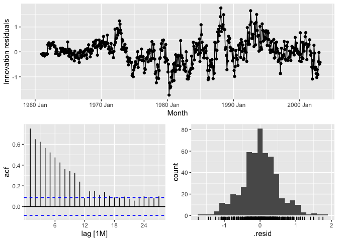
While the residuals are approximately normally distributed, they are not white noise which breaks assumptions.
STL Residuals:
canGas_mdl %>%
  select(stl) %>%
  gg_tsresiduals()
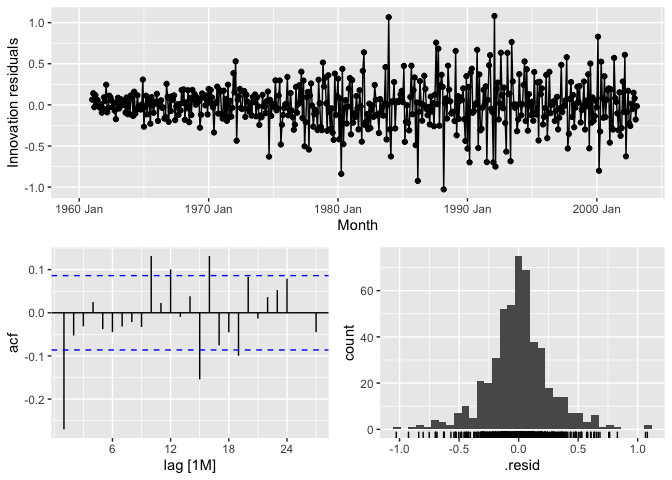
We have less autocorrelation than we did with the RW model, but still we see a good bit of it at lag 1, particularly. We also have heteroskedasticity. Assumptions are not met.
ARIMA Residuals:
canGas_mdl %>%
  select(arima) %>%
  gg_tsresiduals()
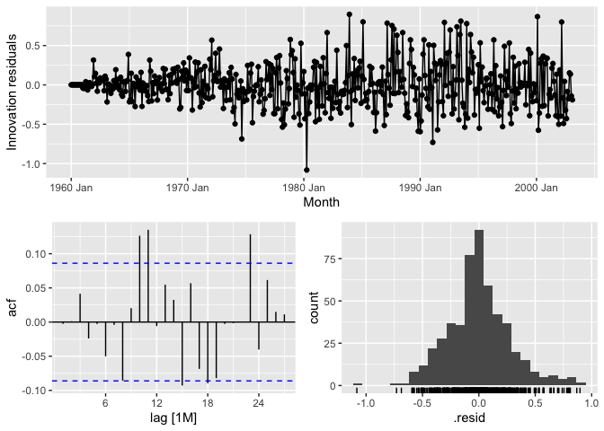
ARIMA does a nice job at limiting the autocorrelation in the residuals up until lag 10 and 11. Still not quite white noise, though.
If it weren’t so obvious from the visualizations, we may choose to run Portmanteau tests, such as Box-Pierce or Ljung-Box, on the data to see if we do in fact have autocorrelation.
So, none of these models were able to completely eliminate autocorrelation from the residuals, which means there is still some information in the series that could be used to create better models. This isn’t particularly surprising due to the odd increase in variability in the middle of the series. It could be difficult to get a model to account for that properly. If we had some other information in our data then perhaps we create a Dynamic Regression model to try to get the rest of the autocorrelation out of the residuals.
Let’s see how the forecasts turned out despite not having great residuals.
canGas_mdl %>%
  forecast(h = '2 years') %>%
  autoplot(canadian_gas, level = NULL) +
  coord_cartesian(xlim = c(yearmonth("2000 Jan"),yearmonth("2005 Feb")),
                  ylim = c(15,20))
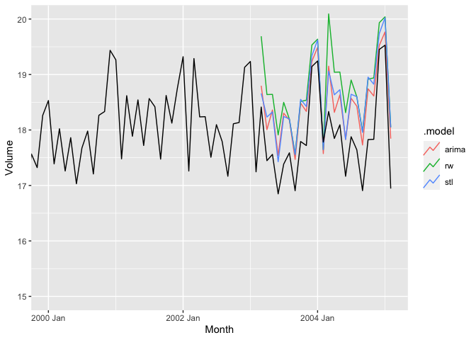
At a glance, it seems like all of the models tend to overestimate the actual value of the series and that either ARIMA or STL is the best fit.
canGas_mdl %>%
  accuracy() %>%
  arrange(RMSSE) %>%
  bind_rows(canGas_mdl %>%
  forecast(h = "1 year") %>%
  accuracy(canadian_gas) %>%
  group_by(.type) %>%
  arrange(RMSSE) %>%
  ungroup())
## # A tibble: 6 x 10
##   .model .type           ME  RMSE   MAE     MPE  MAPE  MASE RMSSE     ACF1
##   <chr>  <chr>        <dbl> <dbl> <dbl>   <dbl> <dbl> <dbl> <dbl>    <dbl>
## 1 stl    Training  2.91e- 4 0.266 0.190 -0.0150  2.22 0.360 0.410 -0.270
## 2 arima  Training -1.84e- 4 0.278 0.206 -0.0467  2.39 0.391 0.429 -0.00253
## 3 rw     Training -4.76e-16 0.509 0.383 -0.203   4.68 0.727 0.784  0.752
## 4 arima  Test     -4.96e- 1 0.582 0.530 -2.82    3.02 1.01  0.897  0.421
## 5 stl    Test     -5.33e- 1 0.606 0.556 -3.03    3.16 1.05  0.934  0.212
## 6 rw     Test     -7.65e- 1 0.862 0.788 -4.33    4.46 1.49  1.33   0.515
We see that for both the training and the test sets, STL tends to do the best with ARIMA just behind it, as we noted when looking at the graph. I tend to consider RMSSE and RMSE when in the model selection process.