Logistic Regression: Modeling Bank Account Closures
Background and Info
Logistic regression is necessary when you have a categorical response that could be regressed or predicted by some explanatory variable(s). The difference between it and linear regression is simply that the errors follow a binomial distribution as opposed to a normal distribution. This adjustment in assumption requires different procedures. The resulting fitted values will be a probability and an ‘S’ curve, hence why it is called logistic.
The data and project concept comes from DataCamp’s Intro to Regression in R course.
In this mini-project, we will examine real banking data in order to see if there is a relationship between someone closing their account or not and how long it has been since they’ve been with the bank and how long its been since their last purchase. There are negative values which represent time because they have been standardized, due to confidentiality reasons.
Let’s try to fit a linear model and observe why it does not work.
library(fst)
library(here)
library(tidymodels)
churnDat <- read_fst(here("data","churn.fst"))

churn_lm_mdl <- lm(has_churned ~ time_since_first_purchase,data = churnDat)
coefs <- coefficients(churn_lm_mdl)

intercept <- coefs[1]
slope <- coefs[2]


ggplot(churnDat,aes(time_since_first_purchase,has_churned)) +
  geom_point() +
  geom_abline(slope = slope,intercept = intercept) +
  xlim(-10,10) +
  ylim(-.5,1.5)
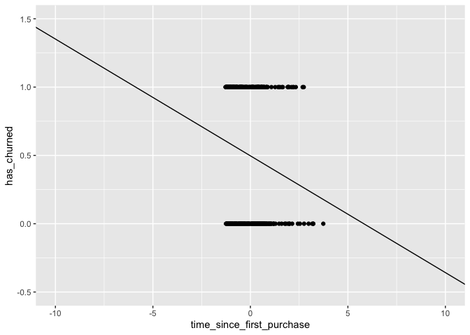
Notice that a linear model could return values outside of [0,1]. This is an issue since what we are looking for technically are probabilities.
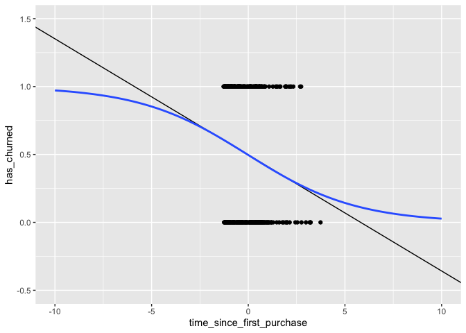
churn_mdl <- glm(has_churned ~ time_since_first_purchase,family = binomial,data = churnDat)

ggplot(churnDat,aes(time_since_first_purchase,has_churned)) +
  geom_point() +
  geom_abline(slope = slope,intercept = intercept) +
  stat_smooth(method = "glm",
              fullrange = TRUE,
              method.args = list(family = binomial),
              se = FALSE) +
  xlim(-10,10) +
  ylim(-.5,1.5)
## `geom_smooth()` using formula 'y ~ x'
churn_mdl
##
## Call:  glm(formula = has_churned ~ time_since_first_purchase, family = binomial,
##     data = churnDat)
##
## Coefficients:
##               (Intercept)  time_since_first_purchase
##                  -0.01518                   -0.35479
##
## Degrees of Freedom: 399 Total (i.e. Null);  398 Residual
## Null Deviance:       554.5
## Residual Deviance: 543.7     AIC: 547.7
Notice that the logistic curve never exceeds the [0,1] limit and that it has a slight curve even within the bounds of the data.
We can use this model to predict the probability of someone churning.
And since we have probabilities, we can simply use the round()
function to predict the outcome. Let’s simulate random times from a
normal distribution and use the model to predict what their outcomes
would be.
new_dat <- tibble(time_since_first_purchase = rnorm(25))

prediction_dat <- new_dat %>%
  mutate(has_churned = predict(churn_mdl,new_dat,type = 'response'),
         likely_outcome = round(has_churned))

head(prediction_dat)
## # A tibble: 6 x 3
##   time_since_first_purchase has_churned likely_outcome
##                       <dbl>       <dbl>          <dbl>
## 1                    -1.41        0.619              1
## 2                    -1.18        0.600              1
## 3                    -0.710       0.559              1
## 4                     0.562       0.447              0
## 5                    -0.525       0.543              1
## 6                     1.55        0.362              0
Odds & Log-Odds Ratio
Probabilities can be difficult to contextualize for a non-tecnical audience. Gambling-style odds typically are more effective. Odds Ratio’s are the ratio between the probability of success to its complement. Simply, \(Odds_{ratio} = \frac{P(X)}{1-P(X)}\) .
prediction_dat <- prediction_dat %>%
  mutate(odds_ratio = has_churned / (1-has_churned))

head(prediction_dat)
## # A tibble: 6 x 4
##   time_since_first_purchase has_churned likely_outcome odds_ratio
##                       <dbl>       <dbl>          <dbl>      <dbl>
## 1                    -1.41        0.619              1      1.63
## 2                    -1.18        0.600              1      1.50
## 3                    -0.710       0.559              1      1.27
## 4                     0.562       0.447              0      0.807
## 5                    -0.525       0.543              1      1.19
## 6                     1.55        0.362              0      0.568
So, for the first record we would then say that this individual is 1.06x more likely to churn than to not. Any value over 1 indicates that the person is more likely to churn, and the inverse is true for an odds ratio less than 1.
We have one issue, though. There is not a linear relationship between the explanatory variable and the probability (nor the odds ratio).
ggplot(prediction_dat,aes(time_since_first_purchase,odds_ratio)) +
  geom_line()
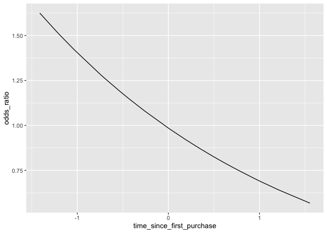
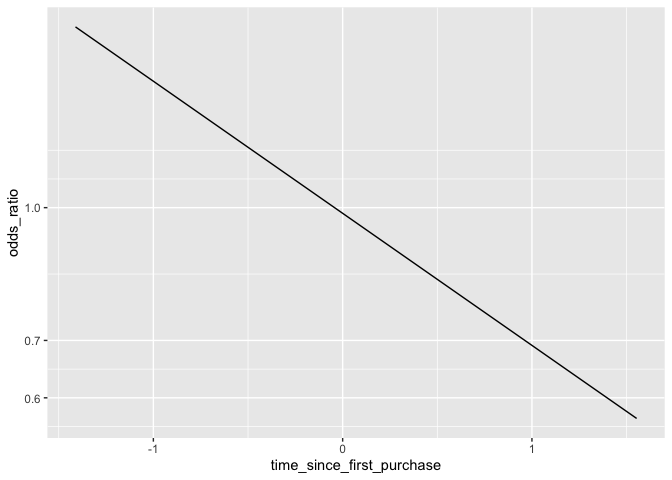
This is an issue because it can be difficult to understand exactly how the odds will change given a shift in the explanatory variable. To address this, a common technique is simply to take the logarithm of the odds ratio. Since the actual values of the log-odds are not intuitive, it is more effective to simply change the scale of the axis rather than actually touch the values. This way we know what the actual odds are, and can still see its relationship with the explanatory variable as linear.
ggplot(prediction_dat,aes(time_since_first_purchase,odds_ratio)) +
  geom_line() +
  scale_y_log10()
Assessing Model Fit: Confusion Matrix
Creating a confusion matrix is very simple in R, and the tidymodels
family has some great functionality for them as well.
A confusion matrix simply is a 2x2 table showing True Positives, True Negatives, False Positives, and False Negatives. It’s a great way to quickly get a sense for how the model performed.
actual_responses <- churnDat$has_churned
predicted_responses <- round(fitted(churn_mdl))

confMat <- table(predicted_responses,actual_responses)

confMat
##                    actual_responses
## predicted_responses   0   1
##                   0 112  76
##                   1  88 124
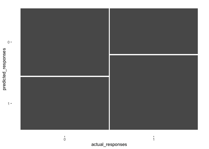
Using the yardstick package, we can convert the table to a Confusion
Matrix object which will allow us to vizualize and extract performance
metrics.
confMat <- conf_mat(confMat)

autoplot(confMat)
summary(confMat,event_level = "second")
## # A tibble: 13 x 3
##    .metric              .estimator .estimate
##    <chr>                <chr>          <dbl>
##  1 accuracy             binary         0.59
##  2 kap                  binary         0.18
##  3 sens                 binary         0.62
##  4 spec                 binary         0.56
##  5 ppv                  binary         0.585
##  6 npv                  binary         0.596
##  7 mcc                  binary         0.180
##  8 j_index              binary         0.180
##  9 bal_accuracy         binary         0.59
## 10 detection_prevalence binary         0.53
## 11 precision            binary         0.585
## 12 recall               binary         0.62
## 13 f_meas               binary         0.602
The plot visualizes the proportion of each category. The widths of the columns indicate the proportion of the data which falls in each group. For our data, there was an equal number of ’0’s and ’1’s. The goal is to maximize the size of the top left square and the bottom right square, since this would mean we perfectly predicted the outcomes.
There are many metrics that summary() puts out, but the ones most
typically considered when trying to get a sense of model performance are
accuracy, sens (Sensitivity), and spec (Specificity).
Accuracy: \(\frac{TN +TP}{TN + FN + TP + FP}\)
- This tells us how often our model was correct regardless of outcome of the response
- Accuracy = .59 or 59% for this model
Sensitivity: \(\frac{TP}{FN +TP}\)
- This describes the proportion of ‘predicted true’ out of all ‘actual true’ outcomes - Sensitivity = .62 or 62% for this model
Specificity: \(\frac{TN}{TN + FP}\)
- This describes the proportion of ‘predicted false’ out of all ‘actual false’ outcomes - Specificity = .56 or 56% for this model
Ideally, all three of these metrics would have high values. But, there tends to be a trade-off between Sensitivity and Specificity. In this case, our model was more sensitive than it was specific. In other words, it did a better job at accurately predicting True Positives than it did True Negatives.
Assessing Model Fit: Hosmer and Lemeshow R-square & Likelihood Ratio p-value
We can determine model significance using a Likelihood approach. This is done by comparing the ‘null’ model, or the model without any predictive terms in the equation, to the model we have created. The values we need to do this are stored in the model object. The difference between the two statistics are what we call the ‘model Chi-square’, since it follows the Chi-square distribution.
churn_mdl$null.deviance - churn_mdl$deviance
## [1] 10.78704
Dividing by the null model’s value gives us a pseudo R-square value, which describes the proportion of the variability that the model can account for.
(churn_mdl$null.deviance - churn_mdl$deviance) / churn_mdl$null.deviance
## [1] 0.01945301
so, our model only explains about 2% of the variance in the data. Not great. We can use this Chi-square statistic to estimate a p-value which will help us understand if our model is significant or not.
1 - pchisq((churn_mdl$null.deviance - churn_mdl$deviance) / churn_mdl$null.deviance,
           churn_mdl$df.null - churn_mdl$df.residual)
## [1] 0.8890756
Since we have a large p-value, we fail to reject the null hypothesis that the current model does not perform significantly better than the base model with no predictors.